CROSSPOST: This article was originally posted as part of PerfPlanet Calendar 2017 on December 6th, 2017
Speed is a major contributor to user experience on modern web sites.
It is important to pay attention not only to technologies that said experiences are build with, but to the way they are designed as well.
Proper speed design is a collaboration between product managers, UI designers and developers as all the aspects of the page composition must be balanced to achieve fast experience that is useful for end-users and deliver on the goals set by creators of the site.
Start bringing speed into the process early on, when design is just being born. I hope to help with this task by documenting a series of patterns that are commonly seen in fast web sites!
Introducing a new project to collect speed patterns: https://www.speedpatterns.com/
Below are a first two patterns: “Fast Start” and “Immutable Layout“, I hope you enjoy the format and will help by contributing to the project on GitHub.
Fast Start
Before user can start the experience, there is an inevitable delay as user’s browser goes away from previous view to the current view.
This delay manifests itself in waiting for first piece of the UI to be painted on the screen. Usually user waits for page to show while looking at the previous page, e.g. search engine results page or another page where they performed an action that led him to the page in question.
On this filmstrip, previous page is shown as white:

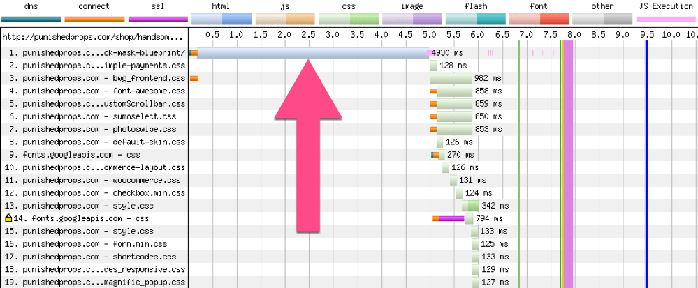
The usual cause for such delays are either a bottleneck of a first request for HTML page:

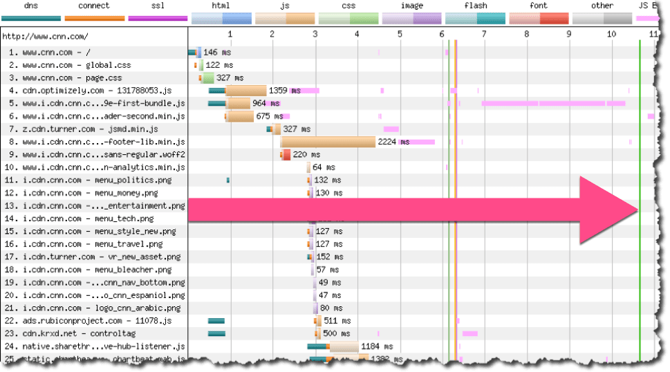
Alternatively, delay can be caused by various render-blocking assets loaded on the page, like CSS stylesheets, fonts or pure rendering delays due to time-consuming layout and painting or JavaScript compilation and execution that compete for same CPU resources:

Solution
Making it a requirement to start painting quickly is critical, especially as it competes with other technical and design goals of loading large amounts of code and displaying a large number of elements on the page.
Set timing SLAs during product and design discussions: 50-200ms
Immutable Layout
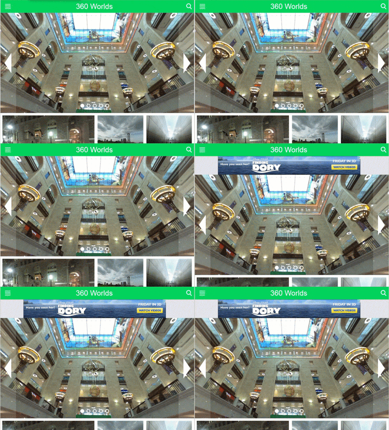
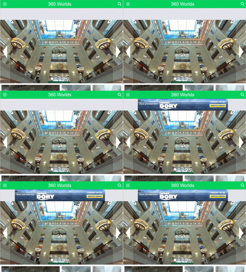
A common problem on web sites that use ads or other 3rd party display elements (widgets), but also manifests in regular websites is change in layout as page loads.
This is particularly noticeable by users when they start scrolling down the page and element at the top of the page (e.g. ad banner or carousel image that finally loaded) suddenly changes it’s height pushing content down.

Solution
Instead of shifting the layout, always set the expected size of the available space.

Use CSS to set height/width of the container when loading element into it and for images, simply specify width and height directly on a tag so layout engine doesn’t have to wait for image bytes to come back from the network to determine its pixel dimensions.
<img src="awesome_logo.png" alt="Awesome Logo!" width="400" height="300">
I’d love to see this project grow as a community effort, you can help by submitting new patterns, reviewing drafts and existing patterns as well contributing illustrations, links and examples.